As more and more healthcare communication goes online, we hear a lot about how design has to adapt to the digital media. But designers need to be careful not to lose touch with some of the fundamental principles of design
Today’s communicators have to embrace new technologies at a dizzying rate. But in terms of typography, the standards that were first set in the fifteenth century are still considered the benchmarks today.
We can now display almost every typeface in our web browsers and there are signs that the web will soon allow the same degree of typographic refinement that we are used to in print.
The medium may have changed enormously since the early days of the printed word but our eyes and our brain still consider light, contrast and colour in the same way. And with today’s technology providing a higher resolution than ever before, and thus greater detail than we could ever need, the requirement for greater refinement in our type is paramount.
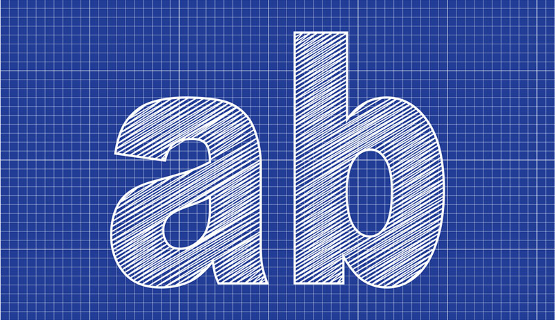
So what is kerning?
Kerning, as we know it today, is the adjustment of space between two specific characters (or glyphs) with the two characters being kerned known as kern pairs. Letter combinations that are too closely or too loosely spaced create uneven colour. Improving the spacing gives a more pleasing, readable text. Most often, kerning adjustments will have a negative value, but they can have a positive value too.
Historically, the meaning of kern was different. In the days when all type was cast in metal, the kern was the part of a letter that extended beyond the body (or shank), so that it could rest on the body of the adjacent character, enabling better letterfit and a more considered setting. Kerning described the act of removing part of the type body. In metal typesetting, this was labour-intensive and expensive because of the physical modification, so was restricted to letter combinations that needed it the most.
With the arrival of digital fonts, it is much easier to kern multiple character combinations. Most professional-quality fonts will have between two hundred and five hundred built-in kern pairs, even thousands for some OpenType fonts, and will require less manual kerning. Free-to-download fonts have obvious appeal but they will require much greater attention in use, which could prove costly and time-consuming in the long term.
When type designers draw type, the amount of space each glyph takes up is carefully set and the major problems are fixed. A classic example is the spacing between a capital ‘A’ and ‘V’. With ‘A’ and ‘V’ they would typically be spaced so that the terminals of their diagonal strokes almost touch the vertical strokes of the adjoining letter, e.g. ‘N’. When the ‘A’ and ‘V’ are set together, the spacing looks too open. Kerning adjusts the spacing to be optically correct. Letter and punctuation combinations will also be improved, for example a period (full stop) or comma with a capital ‘T’ or ‘W’.
Kerning should not to be confused with tracking. Kerning adjusts the space between individual characters. Tracking, or letter spacing is the uniform addition or subtraction of space across multiple characters – e.g. a single word or full line of text.
When to kern
Generally speaking with most text faces, the kerning has been done for you. You should only kern what you have to and if you use quality fonts, you can take advantage of the kerning that comes built in. With most software programmes today, the kerning is automatic. In Adobe InDesign and Illustrator, there are two automatic settings. Make sure your default kern setting is set to Metrics in InDesign and Auto in Illustrator. Don’t set your default to zero or Optical. Both settings will ignore the kerns in the font data, and with the Optical setting, the spacing between every character is kerned by a robot that’s not very good at kerning. Both programmes also allow the user to manually override the automatic settings and apply a kerning value to a particular pair of characters in a specific place in the text.
Kerning large blocks of text is impractical and should be kept to a minimum. Attention should be placed on headlines, where problems are more obvious. Familiarity with a font will also enable you to look out for recurring errors or omissions made during the font’s design.
How to kern
There are differing techniques, but the idea is to look at the spacing across a word or line as a whole. Sometimes it helps to look at it upside down or backwards. When you find a pair that needs adjusting, you can put your cursor between the two characters, and Alt + Left Arrow to kern tighter, Alt + Right Arrow to kern looser. Learning to kern properly takes time, patience and an experienced eye. Remember – kerning, when done right, should remain invisible.
Kerntype – a kerning game
If you’d like to have go at kerning, Mark MacKay over at Method of Action has created a great little game – it works on the iPad too – that will help to ‘get your eye in’.
Testing your kerning skills against a typographer’s solution, “your
mission is to achieve pleasant and readable text by distributing the
space between letter examples.” You will be given a score depending on
how close you are. Good luck